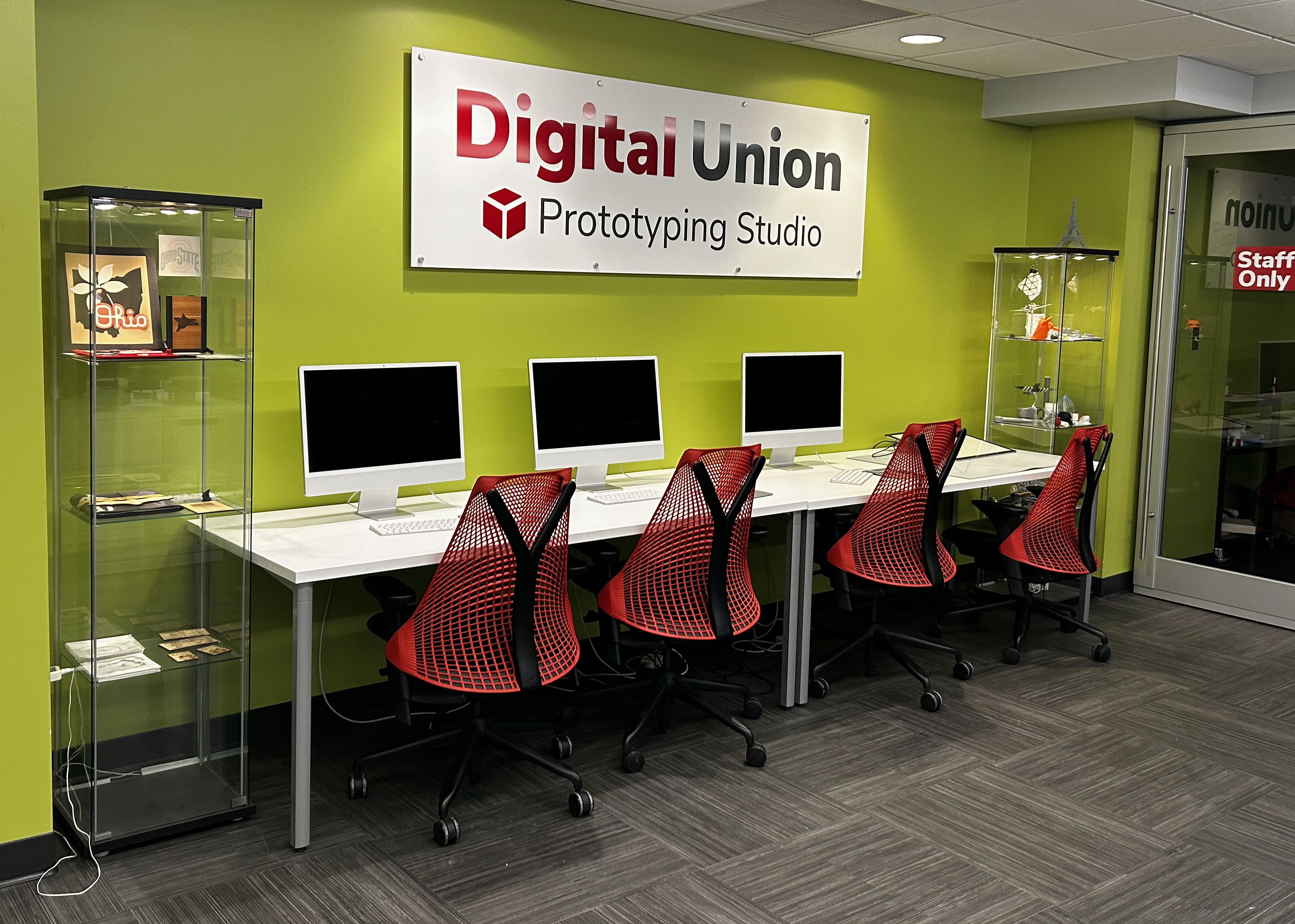
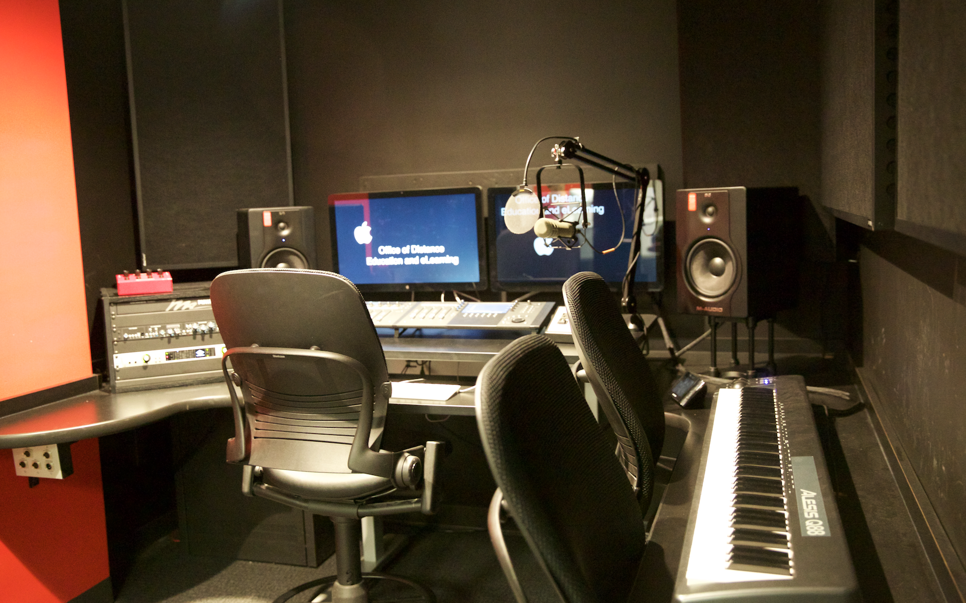
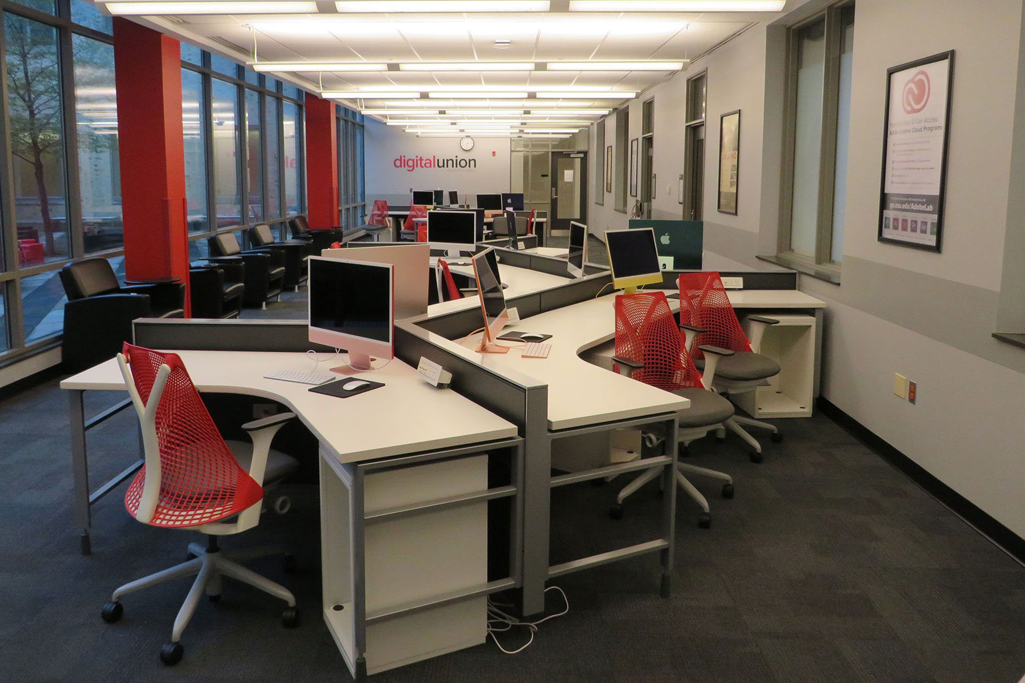
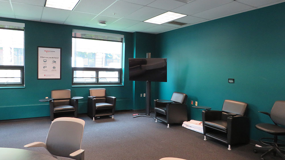
jQuery‘s power lies not only in its robust core functions, but in the many incredible plug-ins created by good-willed developer types. An example of this…? Look no further than Flot.js, created by Ole Laursen. Flot.js bills itself as “Attractive Javascript plotting for jQuery”, and it is exactly that. Flot.js provides a simple jQuery function for producing very swell-looking graphs and charts. All you have to do is provide Flot with your data and a few options. The amount of customizable options is enormous, but I’ll show you what three basic graphs might look like in case you want to get your feet wet.
What you’ll need
- jQuery (jQuery 1.7.1 is current as I’m writing this)
- Flot.js (version 0.7 is current)
- Something to edit code in, I suppose…
Getting Started
My set up is nothing particularly amazing. I’ve just cobbled together a “css” folder with a stylesheet file I’ve called flot-example.css. I’ve added a “js” folder to hide all of the JavaScript in. I’ve dumped jQuery in there. To get Flot all I did was unzip the flot download and stick the entire folder in there. In practice you probably aren’t going to need everything in there. It has examples and lots of plug-ins, but for this little tutorial we really just need jquery.flot.min.js and jquery.flot.pie.min.js (…and if you’re developing for compatibility with IE8 or lower, you’ll need to include the excanvas.min.js file). I just kept it all in there in for the heck of it. Other than that, I’ve made a “flot-example.js” file which is where I’ll do all of my custom JavaScripting for these examples. Oh, right, and “index.html” just has 3 divs in it where the examples can go (and the scripts/stylesheet linked in).
A basic graph with two series
Soooo… how do we make a graph with this? First off, in your HTML document you’ll need access to jQuery, the basic Flot function, and a place to do your own scripting (which in this case will be “flot-example.js”). You’ll need these scripts linked in in the head of your HTML like so:
<script language="javascript" type="text/javascript" src="js/jquery-1.7.1.min.js"></script>
<!–[if lte IE 8]><script language=”javascript” type=”text/javascript” src=”js/flot/excanvas.min.js”></script><![endif]–>
<script language=”javascript” type=”text/javascript” src=”js/flot/jquery.flot.min.js”></script>
<script language=”javascript” type=”text/javascript” src=”js/flot/jquery.flot.pie.min.js”></script>
<script language=”javascript” type=”text/javascript” src=”js/flot-example.js”></script>
Note that I’m just sticking the jquery.flot.pie.min.js file which grants you the pie chart stuff. If you aren’t doing pie charts, you won’t need that file.
Also, note the conditional comment that includes the excanvas.min.js script. This script is needed for compatibility with IE8 or lower!
Inside “flot-example.js” do something like this:
// example 1 - two basic series
$.plot(
$("#flot-example-1"),
[
{
label: "Series 1",
data: [ [0, 0], [1, 1], [2, 1], [3, 2] ],
lines: {show: true},
points: {show: true}
},
{
label: "Series 2",
data: [ [0, 3], [1, 5], [2, 8], [3, 13] ],
lines: {show: true},
points: {show: true}
}
]
);
And you’ll get:
Wow! Well, I guess it’s… exciting on some level. It’s is amazing in that it pretty much has drawn everything for you, and even figures out the ranges for the x and y axes based on the provided data set.
Notice how the $.plot function works. The first parameter is a jQuery object in which to put the graph. In this case it’s a jQuery object made from a <div> with an id of “flot-example-1″.
NOTE: The thing about the element in which you stick the graph is that it MUST have a height and width. You can do that with an inline style attribute, or with a CSS rule somewhere.
The second parameter is an array of object representing each series. There are a lot of options you can set here, these just scratch the surface (e.g. a label, whether to show the points and lines, etc.). The most important thing to note in these objects is how to give the plot function your data. Notice that it’s just a 2-dimensional array. In practice, you’d probably be formatting that from some data source, but if you really do have a small data set and really want to use flot, you can, of course, hardcode it.
A simple bar graph
There is a third parameter you can pass to the $.plot function which is an object consisting of whatever general options you want to set on your graph. I’ll use one to set some discrete tick marks on a bar graph.
Try out this in “flot-example.js”
// example 2 - basic bar graph
$.plot(
$("#flot-example-2"),
[
{
label: "Total Things Per Year",
data: [ [2011, 450], [2012, 550], [2013, 320], [2014, 700] ],
bars: {
show: true,
barWidth: 0.5,
align: "center"
}
}
],
{
xaxis: {
ticks: [
[2011, "2011"],
[2012, "2012"],
[2013, "2013"],
[2014, "2014"]
]
}
}
);
…and you’ll get something this here thing:
So, you can see in the series object, I can define some options for bars. I can also, in the third parameter create an object that defines the tick marks which takes another 2D array and sets a text label on discrete values on the x-axis. Similarly, you could do this for the y-axis by using an option called “yaxis”.
A pie chart
You can use a plug-in for Flot by including the jquery.flot.pie.min.js file. Here’s how that works, try this:
// example 3 - basic pie chart
$.plot(
$("#flot-example-3"),
[
{
label: "This",
data: 44
},
{
label: "That",
data: 75
},
{
label: "The Other Thing",
data: 22
}
],
{
series: {
pie: {
show: true,
label: {
show: true
}
}
},
legend: {
show: true
}
}
);
…and out of the JavaScript oven will come:
I’ll spare you the obligatory pie joke (well, I guess that “oven” remark above covers it).
Notice that defining the data for the pie chart is a little different. It’s an array of objects with keys for a “label” and “data”. Setting up the rest involves adding a “series” option with a “pie” option. In the pie option I could add an option to show the labels outside of the associated regions of the pie. Here’s a good list of most of the basic flot pie options. Try them out! I’d particularly check out the “combine” options that can combine a wedge of all percentages that fall beneath a specified threshold.
There you have it…
This little sojourn barely scratches the surface of what Flot can do. Though, I hope this little tutorial gives you a springboard for exploring the more advanced features.
To learn more, check out:
If you want to take a closer look at the code I’ve used in this tutorial you can download it:


2 Comments
Sorry, there are no images on the examples you have shown. The “wow” factor is missing without seeing the results of your code.
Hi Karen,
Whoops! Thanks so much for pointing that out!
The problem was that I had neglected to mention adding the excanvas script needed for compatibility with IE8 or lower. I had only tested my code in IE9 and it had slipped my mind that I’d need to put that in there.
I’ve updated the article and files with that information. You should be able to see the graphs now. Let me know if they still aren’t there.